
Most websites still treat mobile as an afterthought, leaving your brand’s message scattered across screens. Your customers switch devices constantly, expecting smooth, consistent browsing every time. Defyn Digital’s mobile-first design templates adapt flawlessly to every screen, keeping your brand integrity sharp and your user experience clear—no matter where they visit from. Ready to see how responsive web templates can reshape your online presence? [https://muffingroup.com/blog/responsive-website-templates/]
Mobile-First Design Benefits

In today’s digital world, mobile-first design is crucial. Your audience expects seamless browsing, no matter the device. Mobile-first strategies cater to this need, enhancing engagement and satisfaction.
Enhancing User Experience
When it comes to online browsing, user experience is king. Imagine visiting a website that loads swiftly on your phone, with each feature at your fingertips. That’s the beauty of mobile-first design. It prioritises mobile users by ensuring fast load times and intuitive navigation. When you cater to mobile users first, you create a foundation for a smooth experience on larger screens too. This approach anticipates user needs, making it easier for them to find information quickly.
A well-optimised mobile site also increases the time users spend exploring your content. According to a study, people spend 70% more time on mobile-friendly sites. This means more eyes on your products and services, leading to higher conversion rates. Here’s the key insight: a great mobile-first design enhances user engagement, creating loyal fans who keep coming back.
Maintaining Brand Integrity
Brand consistency across devices builds trust. Customers should encounter your brand’s essence, whether on a phone, tablet, or desktop. A mobile-first approach ensures your branding elements, such as logos and colours, maintain their vibrancy and clarity on every screen. This consistency reinforces your brand’s message and positions you as a professional, reliable choice in your field.
Your brand isn’t just about visuals. It’s also about the values and experiences you offer. Mobile-first design supports these by presenting your brand story effectively, no matter the screen size. Companies that maintain brand integrity across platforms often enjoy 23% higher revenue. So, by ensuring your brand looks and feels right everywhere, you not only impress your audience but also boost your bottom line.
Responsive Web Templates
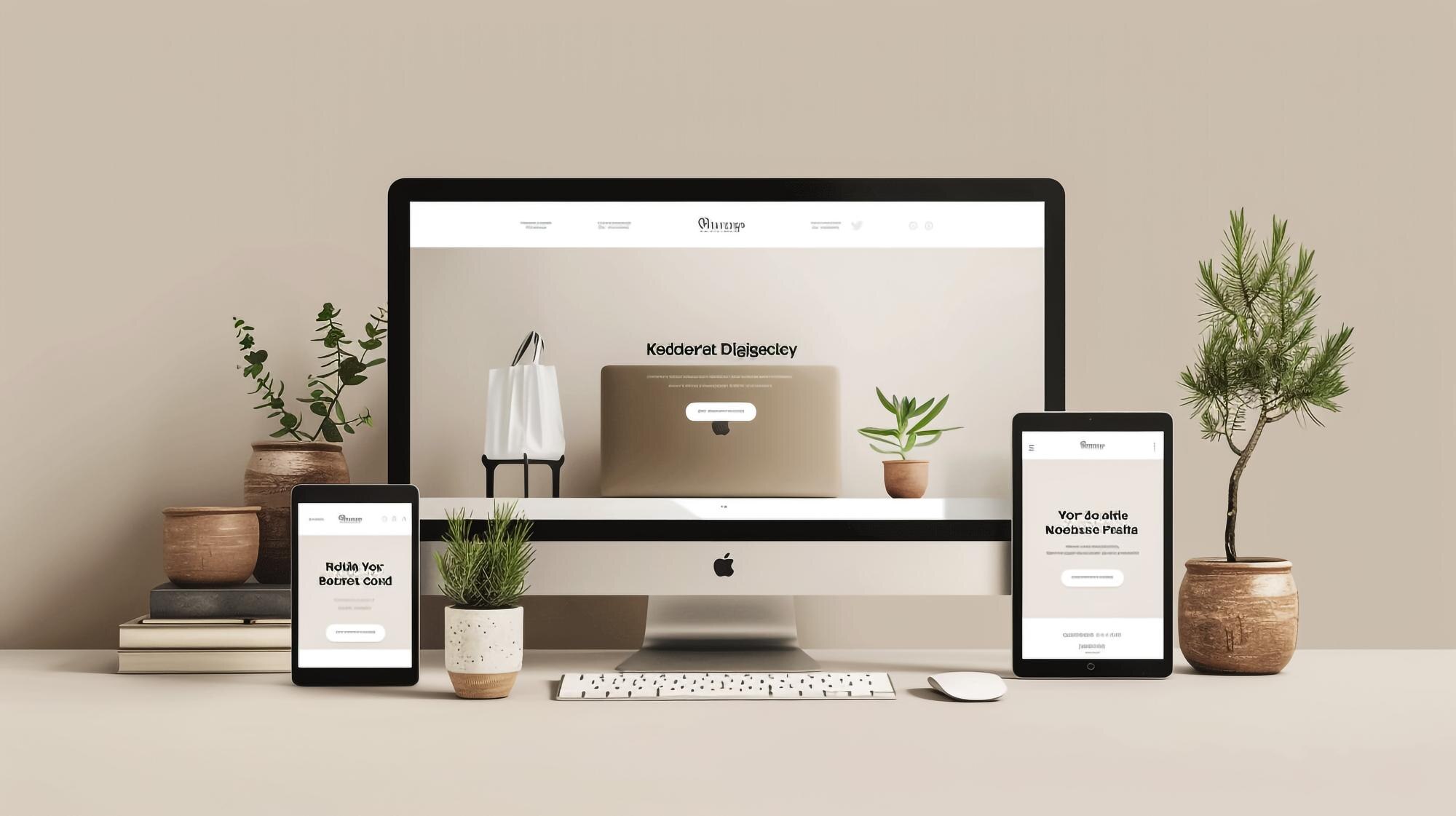
Creating a consistent web presence means embracing templates that adapt. These templates make sure your site looks superb on any device, enhancing accessibility and consistency.
Adapting to Multiple Devices
Today’s users jump from phones to tablets to desktops. Your website must adapt without missing a beat. Responsive web templates do just that. They automatically adjust layouts, ensuring content displays perfectly, no matter the device. This flexibility means users always see your best side, whether they’re on the go or at a desk.
Responsive templates also ease the burden of managing separate mobile and desktop sites. With a single design that adapts to various screens, you save time and energy. Plus, a unified approach reduces the risk of errors and outdated content, keeping your site fresh and engaging. The longer you wait to adapt, the more potential customers you risk losing. Make the switch, and watch your audience grow.
Ensuring Accessibility and Consistency
Web accessibility means everyone can enjoy your site, regardless of ability. By incorporating accessible design principles, you open your content to a wider audience. This includes using clear fonts, ensuring proper contrast, and implementing keyboard navigation. Designmodo offers excellent examples of responsive design that embrace these principles.
Consistency across devices doesn’t just improve user experience. It strengthens your brand by ensuring that users recognise your style and message, no matter where they land. When your website feels the same across platforms, it builds trust and encourages users to explore further. Check out these responsive website examples to see how seamless design can elevate your brand’s presence.
Partner with Defyn Digital
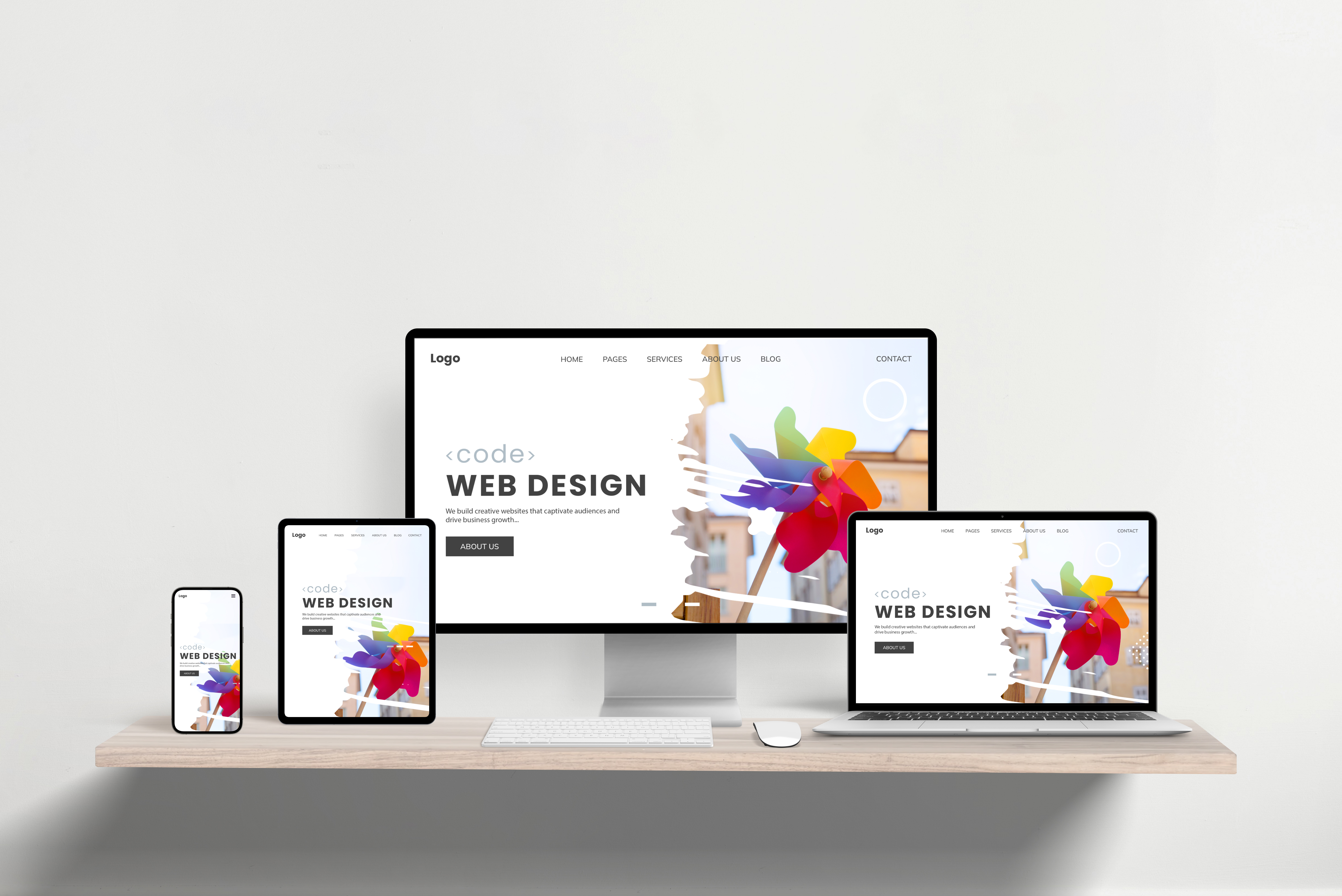
Choosing the right partner in digital design makes all the difference. With Defyn Digital, you’re not just getting a service provider—you’re gaining a strategic partner committed to your brand’s success.
Our Expertise in Responsive Design
At Defyn Digital, responsive design is our forte. We craft websites that adapt to any device, ensuring your brand stands out. Our team of strategists, creatives, and technical experts collaborates to deliver solutions that boost your online presence. We specialise in platforms like WordPress and Shopify, providing you with flexible and scalable options.
Our award-winning agency knows what it takes to create impactful designs. We combine creativity with technical know-how to build sites that are not only beautiful but also functional. Explore our resource library on mobile-first design for insights and inspiration. With Defyn Digital, your website is in capable hands, ready to perform at its best.
Success Stories and Client Testimonials
Our clients’ successes are a testament to our expertise. Take the story of a local cafe that saw a 50% increase in online orders after we revamped their website. By focusing on mobile-first design and user-friendly navigation, we made it easy for customers to explore their menu and place orders swiftly.
Another client, a burgeoning e-commerce brand, wanted a site that could handle traffic spikes without a hitch. Our responsive design ensured their pages loaded quickly, even during sales events. Their sales doubled within three months of the redesign. Interested in more success stories? Explore these responsive website examples to see how responsive design can transform your business.
Choosing Defyn Digital means choosing a partner dedicated to your growth. Our portfolio of successful projects speaks volumes, and our commitment to ongoing support ensures your site continues to shine. Are you ready to elevate your brand’s digital presence? Let’s make it happen together.